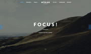
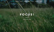
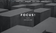
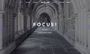
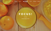
• Focus!

    Photo Centric Theme
  • Bounce!

    Animated Content Effects
  • Power!

    Core Gantry Framework
  • 1
  • 2
  • 3
image

Dropdown Menu with Advanced Options

An array of features such as multiple columns and inline modules Read More
image

Responsive structure that auto-adapts

Support for different screen widths, such as Desktop, Tablet and Mobile Read More
image

Extensive Color Chooser Controls

Control the background and text colors for every module row Read More
image

Built on the Core Gantry Framework

Gantry is the foundation for all features and functions Read More
image

Load Effects to Animate Content

A series of content animations, activated by inline classes Read More
  • 1
  • RokSprocket

    A powerful, content switchblade extension with multiple default layout modes and various theme variants, alongside its custom administrative interface. RokSprocket therefore, provides a quick and easy solution in delivering sophisticated content structures, with efficiency and style.
  • RokBooster

    RokBooster is an advanced performance plugin, that will compress and collate your CSS and JavaScript files; alongside data URL conversion for Fonts as well as inline or background images, which converts files to inline data; reducing HTTP calls data load size, increasing site speed.
  • RokAjaxSearch

    RokAjaxSearch displays search results live via AJAX. The results automatically appear as you type your search inquiry. The results dropdown includes multi-page navigation as well as extensive configuration options. RokAjaxSearch is shown on the demo's Blog page.
  • 1
  • 2
  • 3

About Myriad

Myriad centers around photography, providing an elegant space for displaying full width galleries. The structure, whilst focusing on images, maintains a refined and conservative style option.

The theme makes uses of animated effects to add depth and character to content, without compromising on usability and professionalism. A series of bounce and slide effects are built into Myriad, as triggered by scroll events, with an option to disable them.

A responsive layout adapts automatically to the viewing device's width, such as mobile, tablet or desktop, without the need for a separate layout or content. Mobile modes have a unique menu to aid usability. 960px and 1200px fixed layout options are also available.

Read the Whole Story

Photo Gallery

image

image

image

image

More About Myriad

 
  • image Clean and custom font choices individualize your content, alongside FontAwesome's catalogue of icons. Read More

    Rich Typography

  • image Choose from six configurable style variations or create your own custom presets in the template manager. Read More

    Style Variations

  • image LESS CSS brings PHP-esque variables and features to stylesheet to improve development speed. Read More

    LESS CSS

  • image Gantry has RTL support for its grid structure to switch positions, alongside template specific adjustments. Read More

    Basic RTL Support

  • image Select from a series of compoundable stylistic and structural module variations to diversify your modular content. Read More

    Module Suffixes

  • image With Chart.js, you can create stunning and exquisite graphical charts with ease, all using HTML5 Canvas. Read More

    HTML5 Charts

  • 1

From Our Blog

 
  • Individual Template Overrides +

    Gantry offers the ability to override default template Read More
  • Configurable Preset Styles +

    Gantry makes use of a powerful Preset system Read More
  • Dynamic Layout Panel +

    The Layouts panel in the Gantry-based template administration Read More
  • 1
  • 2
  • 3