
Demo Content
Demo Content
IE6 PNG Fix
What is the PNGfix?
If you have ever opened a webpage with a transparent PNG in Internet Explorer 6, you will see an obvious problem. The images do not appear transparent but adopt a light blue background, which is unsightly to say the least. This is the purpose of the PNGfix, to allow transparent PNG images to work correctly in the web browser Internet Explorer 6. A common way around this is to use a range of different Joomla! extensions which can be applied to your site. However, this is already built in to new RocketTheme templates (the fix already provides other solutions to various other IE6 issues). The author of this new PNGfix is Drew Diller.Learn More
Below is a list of all the Rocket Theme Templates which have the PNGfix described above, incorporated into it. Also, all new templates releases will contain this as it has become an recurrent feature.
- SolarSentinel
- Mynxx
- Meridian
- Akiraka
- Mixxmag
How do I use the PNGfix?
To apply the PNGfix to a particular image, all you need to do is add a class, png. We have an example of image HTML code below:-<img src="/sitesweb/2-v3/image.png" alt="Image" />
Now add class="png" to the code such as:-
<img src="/sitesweb/2-v3/image.png" alt="Image" class="png" />
Uninstall all other PNGfixes before using the template version, that includes plugins you may have installed into Joomla as they will conflict with the template fix
How to remove the PNGfix
If you wish to remove the PNGfix from the template, you have to remove the file and remove the reference from the rt_head_includes.php file. The file is called DD_belatedPNG.js and is located in the /templates/rt_solarsentinel/js directory. You would then remove the following from the rt_head_includes.php file:-<script src="/sitesweb/2-v3/<?php echo $this->baseurl; ?>/templates/<?php echo $this->template?>/js/DD_belatedPNG.js"></script>
<script>
DD_belatedPNG.fix('.png');
</script>
Demo Content
The demo for SolarSentinel utilises a large stock of custom code and styling to make the most of every content item and show what SolarSentinel can do. This basically means that the HTML used in the custom modules and content have customisations which employ the characteristics of the template to make the "perfect" content.
This demo content section will take you through some of the content areas and general techniques used to further your understanding and help you realise the true potential of SolarSentinel. If you would like to quickly deploy a replica of our SolarSentinel demo for a new Joomla site, be sure to check out our RocketLauncher package.
Frontpage Leading Article
The following statement produces the leading article on the Frontpage, which is using RokCandy syntax:Obama reverses Bush-era stem cell policy
Federal funding ban on stem cell research liftedMr Obama signed an executive order in a major reversal of US policy, pledging to "vigourously support" new research.
Frontpage Sub Article
The following statement produces the sub article on the Frontpage, which is using RokCandy syntax:
Drugmakers unite in $41.1 billion deal
Merck, Schering-Lough deal gives companies more firepower in a competitive industry. Full Story |Video
Media Headlines
The following statement produces the Media Headlines module on the Frontpage, which is using RokCandy syntax:
Video
The following statement produces the video showcase as seen on Logo Tutorial page, which is using RokCandy syntax:[video url="images/video/logo.mov" title="RokCandy Video Tutorial" img="images/stories/logo-editing-video.jpg" header="RokCandy Video Tutorial" label="Watch Now!"]Learn how to edit the template logo using Adobe Fireworks.[/video]
Read More Buttons
Read more buttons are automatically generated for content items that use the intro and main text option. However, you can easily insert them manually as witnessed on this demo. Use the following code:Read More...
Logo Editing
The following is a step by step guide to customising your SolarSentinel logo image by replacing the logo text with your own organisation or company's name and logo.
In order to utilise the Fireworks Source PNG included with the solarsentinel template release, you will need Adobe Fireworks. The 30-day free trial of this software as well as more information is available here at the Adobe website.Logo Editing Video Tutorial
Learn how to customise your SolarSentinel logo using Adobe Fireworks with this detailed video tutorial.
One of the first steps of customising your new SolarSentinel template will undoubtedly be altering the logo text to reflect the name of your company / organisation. RocketTheme makes this process a simple one by including both the Source PNG for the template, as well as the font(s) used.
The most effective way to customise the logo is to use the included Source PNG file. When opened in Adobe Fireworks, this file contains all of the Layers in the design allowing you to tweak and change any of the image elements of the template design. The following steps will help you quickly get your new logo ready to go:
Step 1
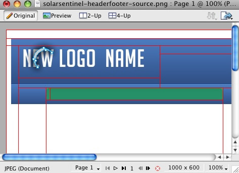
First, open the solarsentinel-headerfooter-source.png file in Adobe Fireworks. On the right side, you will notice a taskbar named Layers. Inside this column, a list of elements within the source will appear, divided into folders. The first is Web Layers which controls the green slices on the page that are used to export the images. Click the eye which is immediately left to the folder name Web Layers to make it invisible. This allows you to edit the logo.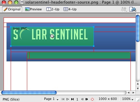
Step 2
Next, double click on the logo. This will activate the text tool so you can edit the element. Highlight the entire text box with your cursor and type your text instead (such as your company name.)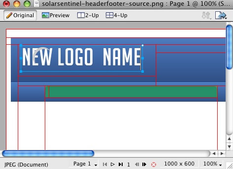
You will notice the crescent icon above the logo name, you can keep it but in this guide we shall remove it.
Step 3
Next, reactivate the Web Layers slice. As you did in the initial step, select the eye icon to make it visible and subsequently making the slices visible on the canvas. Select the logo slice, either on the canvas itself or in the Web Layers folder. If you find the slice is too small, hover your cursor over the blue points around the slice and drag it to a new size.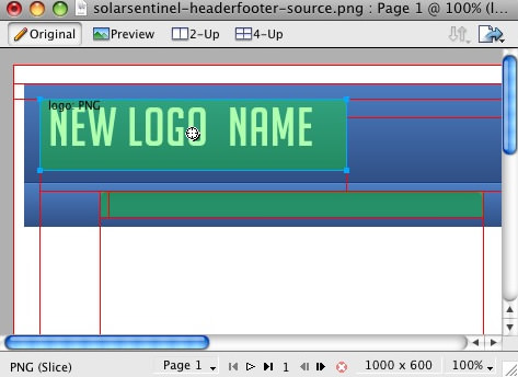
Step 4
To export your logo, right click on the green slice that is situated above your new logo. A popup menu should appear with numerous options. The value we want to deal with is "Export Selected Slice...". As the name suggests, this option will export/save this slice only out of the entire source window.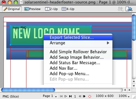
Step 5
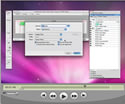
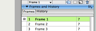
If you are new to Fireworks, you may be wondering why it appears that there is only one style variation in the source. This is not the case as we take advantage of the Frame features of Fireworks. You need to simply switch frames to see all the other style variation sources.There are a few ways to change frames and we will show 2 methods that you can use.
In the right column where you find the Layers toolbar including the Web Layers area, you should see another tab/toolbar named Frames. Just left click on the title Frames to enter the frames area. Then you can click on either of the frames which are named to show which style variant is on that particular frame.
The second method is the most easiest and simplistic. At the bottom of the Fireworks canvas is a row of buttons, arrows just as previous and next. Select the arrows to switch between frames.
 By default, the source should set the export file format to PNG32. If this is not the case, you will need to change your Fireworks export settings. Firstly, expand the Optimise & Align taskbar in the upper right of Fireworks. From the available dropdowns, select PNG32.
Step 6
Once you have successfully edited then exported your new logo, you will need to upload it to your server. This process is best done via a FTP client such as Filezilla- Open your FTP client on your local computer.
- Login to your web server where SolarSentinel is installed.
- Navigate to the /templates/rt_solarsentinel/images/header/*style* directory.
- Upload logo.png (and any other logo related images) to this directory (You may need to browse on the local panel in the FTP client to find where you have exported your logo).
- Clear your browser cache before viewing such as using the keyboard commands on Windows, Ctrl+F5.
Using Typography
A guide to implementing the included typography styles and elements into your site as well as instructions for inserting typography using the HTML editor option of your WYSIWYG editor.
Video Tutorial Currently Available! Launch the Joomla Using Typography Video Tutorial now!Every RocketTheme template has its own set of content styles, these styles are known as Typography. Typography can come in a number of varying and diverse formats, ranging from simple text modifications to image insertions to improve the look, layout of your website and give it life. This tutorial will take you through the necessary steps to adding typography to your Joomla! content.
Inserting Typography with the HTML Editor
To insert the Typography into your content, you must use the HTML feature of all Joomla! content editors. The following tutorial will outline the steps in which to do this with the default Joomla! content editor, TinyMCE. Please be aware, even though there are other content editors available, all are basically the same and the steps would be just as effective if you are using another Content editor.
Please note that the following tutorial will show you how to insert HTML (typography) into Article, the same procedure is apparent for Content Items and Custom modules. You may skip steps 4 and 5 if you are using No WYSIWYG editor or if you are using RokCandy.Step 1 - Login
Login to the Joomla! Administration Control Panel. Go to www.yoursite.com/administrator. Enter the Administrator's Username and password.Step 2 - Navigation
Navigate to the Article Manager. Hover over the Content link on the top taskbar, scroll down to Article Manager.Step 3 - Article Manager
When you have selected the Article Manager link, you will be sent to the Article Manager control panel. Select either Edit (after selecting a particular content item) or New, depending on whether you want to add typography to an existing or new item.Step 4 - HTML Icon
To add typography to your content, you must enter the HTML mode of your Content editor. In the TinyMCE editor, this is an icon called "HTML", in some other content editors, it is a tab. Press the icon to enter HTML mode. This step is not necessary if you are using No WYSIWYG editor.Step 5 - HTML Mode
A popup shall appear with your content in HTML format, only if you are using TinyMCE, with other editors, a new tab may become selected. You shall do all your editing here for typography.Step 6 - Inserting HTML
You then proceed to add your HTML coding into the tab/textbox that appears in front of you. This can be any HTML such as span class typography or styled lists.Configuration
Preset Style
The template is bundled with 10 pre-made style variants that can be easily and quickly chosen from the template configuration. There is also an option for Custom which you will choose if you do not wish to use the preset styles. NOTE: The various options will not work unless you click Custom in the Preset Styles section.Colour Chooser Options
If you selected Custom in the Preset Styles option, you will now have a choice of several options to customise your sites colour scheme. Therefore, you can either manually type your desired colour into the input field or select the colour from the popup.The names of the various selections denote the area that they apply to. Click the Custom Styles button in the toolbar to output your custom style configuration into the Custom Config output box, underneath all the params. You will use these values in the styles.php file to customise your own defaults.
Display Frontpage Component
This setting allows you to select whether the frontpage area (where content items are placed) is active or not. This is useful if you wish to have an entirely modular frontpage and no article-based content.IE6 Warning
Warn your visitors using Internet Explorer 6 to upgrade to a more secure version with this toggle. This option activates a javascript based dropdown in IE6 at the top of the template where a description of why IE6 is a redundant browser is visible. The warning will only appear once as it is stored via a cookie.Font Family
You can choose which font you would like to use for your entire website, these are all web standard fonts.Font Spans
Set to Enable or Disable Font Spans. Font Spans refer to the multi-coloured effect on titles, such as module headers.Input Style
Set to Enable or Disable Input Styles. This is the javascript enabled custom styling for radio icons and similar inputs such as in the Poll. You can see these icons in the params above.Template Width
This template configuration option allows you to easily change the width of the template itself, simply change the number to another pixel value.Left Inset Width
This template configuration option allows you to easily change the width of the left inset position, simply change the number to another pixel value.Right Inset Width
This template configuration option allows you to easily change the width of the right inset position, simply change the number to another pixel value.Splitmenu Location
One of the template's menu options is splitmenu which displays the first level items in the horizontal menu bar and the 2nd in a side column module. This option allows you to choose between the left column or the right column.Default Font
This option allows you to choose what the font size will be, you have 3 options to choose from, these are small, default and large.Show Date
Choose whether the date, in the upper left of the template appears.Client Side Date
Select whether the date is server based or based on the time and date of your visitors computer.Show Main Logo
Choose whether the logo area has the template logo image, or is the logo module position. If this option is set to no and there are no modules assigned to the logo area, it will collapse completely.Show Logo Slogan Text
Choose whether the slogan, to the right of logo appears.Slogan Text
Enter the text you wish to appear for the slogan.Show Copyright
Choose whether the copyright area has the RocketTheme logo image, or is the footer module position. If this option is set to no and there are no modules assigned to the footer area, it will collapse completely.Show Text Size Controls
This setting allows you to disable the text size controls in the upper right of the template.Show Top Button
This setting allows you to disable the top button in the lower right of the template.Mootools / Javascript Compatibility
Enable or disable js compatibility mode for better compatibility with non mootools based js libraries. Warning, setting to "true" will cause several js template features to not work properly.Menu Type
SolarSentinel is bundled with 4 menu options, 3 of which are integrated menu approaches. These are splitmenu, moomenu, suckerfish and module. Splitmenu displays the 1st level menu items in the horizontal bar and the 2nd in the side column; moomenu and suckerfish display the menu items in dropdown lists with moomenu having a javascript powered approach; and the module options turns the menu bar into the toolbar module position so you can insert modules into the area (this will disable the menu however). You can also select none so the entire horizontal menu does not appear.Drop Down Rows per Column
The maximum number of menu item rows per column. Applicable only to MooMenu and Suckerfish, as well as second+ menu levels.Drop Down Columns
The number of columns for a dropdown. Applicable only to MooMenu and Suckerfish, as well as second+ menu levels.Multi-Column Level
The menu level that is affected by the multiple column dropdown affect. Set to 0 to affect all dropdown levels or set a number greater than 0 to specify a particular level with the multiple column function. Applicable only to MooMenu and Suckerfish.Menu Name
The following parameter controls which Joomla menu is loaded for the horizontal navigation bar, by default this is mainmenu but you can change it to whatever menu such as othermenu.Newsflash
Main Menu
Who's Online
Nous avons 1320 invités et aucun membre en ligne